
To-do list concept–honeybee.
background
proposal
Conduct a competitive analysis and significant primary research through user interviews to determine opportunities to enhance how people create and utilize to-do lists. This will be showcased through branding collateral along with a brand new iOS app.
To-do lists have long been part of society–whether long, short, detailed, or brief notes. They help people to organize their thoughts and get tasks from out of their heads and into an actionable, and organizable, space. To-do lists help ensure you aren't forgetting things. They also help you to organize which tasks should be prioritized and which ones can take a back seat. Even the act of writing (or typing) out a list will help you to remember the tasks and reduce stress caused by trying to keep everything organized in your mind only.
Honeybee was founded with the intention of making to-do lists better through keeping them as simple, engaging, and beautiful as possible while solving real-world problems with current options.

process

research
Competitive Analysis
User Interviews
Persona

strategy
Problem Statements
Ideation
Storyboarding
User Flow

interaction design
Wireframes
Prototype
Usability Testing

user interface design
Branding
HiFi Mockups
research
The goals of the research were to determine competitors' strengths and weaknesses along with what pain points currently exist with to-do list keeping, particularly for those utilizing honey-do lists, and what the unmet needs of those creating to-do lists are.
This was accomplished initially through a Competitive Analysis. That was then followed by a first round of User Interviews to get some general feedback on ways that people are creating and tracking to-do lists. After some patterns started to form with general pain points, a second round of user interviews were conducted to focus more on the problems users were having. From that, a Persona was created with the goals/needs and frustrations/fears of to-do list creation and tracking.
The persona for this project was Stephanie–a 38 year old Medical Office Administrator and Mother who loves to stay organized, but finds it difficult to focus on her family and work while doing so. She needs a to-do app that helps her stay motivated and organized while making it as simple as possible to create and complete tasks.


Once the Persona was created, this information was used to develop an empathy map. This tool is used to help empathize with the user through thinking about:
-
what the typical day looks like for the user
-
what their hopes, dreams, or fears are
-
what is important to them
-
what their environment is like
-
what influences them
-
what obstacles stand in their way
-
what they hope to achieve
-
how they plan to measure success
By going through this exercise, we were better able to understand the users' perspectives prior to brainstorming ways to solve a problem.

strategy
With the Persona and Empathy Map in place, the next step was to form a strategy, beginning with the creation of several Problem Statements. These are a list of How Might We statements used to brainstorm the various problems uncovered during research.

From the Problem Statements, a few were chosen to focus on and were then used in an Ideation exercise. During that exercise, we set a timer for 5 minutes and sketched up to 8 different ideas for ways to solve the problem statements. Once the 5 minutes was up, we took a break, and then started again on 8 more ideas. This was repeated several times.
After going through several rounds of ideation, we moved on to creating Storyboards for our favorite ideas in a similar way. Again, we set the timer for 5 minutes and then sketched up to 8 different steps/scenes in a storyboard based on a single idea. That was then repeated for the other top ideas left before iterating on each.


Once the Storyboards were created and a top idea was chosen, they were used to create a User Flow through the new product.
Developing a user flow, or in this case a few flows, helps to ensure all parts of the feature get designed by mapping out exactly what steps a user will go through. This flow is then used to inform the Wireframe designs.

interaction design
Wireframes were then created based on the User Flows, Persona information, Storyboards, Empathy Map, and User Interview data gathered during the research and strategy phases. We focused on overall usability through simple interactions that break up information into digestible pieces, simple design that has good readability, and overall layout. This became the beginning of the look and feel of the new honeybee app.


These Wireframes were then used to create an interactive prototype through InVision. This allowed us to see what elements worked, or didn't work, within the flow that was designed for. From there, designs were revised and updated within the prototype to get a functional baseline for the design.
This prototype was then tested with users in a 1-on-1 setting. All but one were in person, with one being through zoom. This allowed us to learn a great deal about what users were expecting to encounter through a brand new app they hadn't used before. We were also able to gather feedback about some items they expected, or hoped, to see that may have been missing or thought through differently.
During the Usability Test, we tested the flow to complete the following:
-
View tasks for the day and add a location-based reminder for the task without a reminder currently set up
-
View all of the upcoming days tasks at once
-
Add a new personal task for tomorrow
-
Use a reminder to complete a task from the home screen
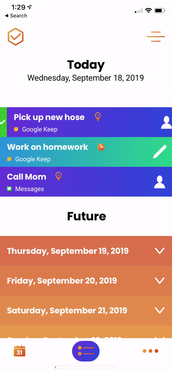
Branding was then created, followed by User Interface Design, where the Wireframes were used to create high-fidelity user interfaces.
user interface design
Since this project was for a completely new product, before starting on any Hi Fidelity screens, we first completed branding and created a style tile to inform the User Interface Design.
The branding was inspired by the colors of honeybees and honeycomb. This then influenced the logo design and color palette.

This style tile, combined with the wireframes and feedback from usability testing, then informed the Hi Fidelity UI Screens.


"It's such a pain switching between a bunch of different apps to keep track of everything."
"I am obsessed with to-do lists, but find them tricky to not have all in one place. Whenever I forget to add something to Google Keep is when I am out and need it."
"I really like the look of this entire app. The colors are beautiful and make me want to use it more than others."
"The today view is really handy. It's nice not to be overwhelmed by all of my tasks or have to dig around to find the ones I need to complete today, but instead have those important to me now right up front."
reflection + next steps
This project is a great lesson in how important good user research is. What you may think is the problem doesn't always turn out to be the biggest, or most important, issue that needs to be addressed. In this case, the original hypothesis was that users needed a one-stop-shop style to-do list app and that they'd be willing to migrate completely over. However, what we instead found was that people enjoy using some of the products they are currently using, but could instead use a new product that could bring everything else they are using together. That would allow them to continue along using what they are already comfortable without while also starting to migrate over to a new product without having to completely start over.
The interaction design is simple and leans on other design patterns users are likely used to using, such as the iOS Calendar app, Notes, Reminders, and Email. This helped to inform the overall look and functionality of the honeybee app.
As for next steps, the first priority would be to perform more user research to determine what additional features would be useful after spending some time using the app in its current state. We would likely focus on adding more of a collaborative functionality that would allow users to add comments and continued iteration on shared tasks, notes, appointments, etc.