
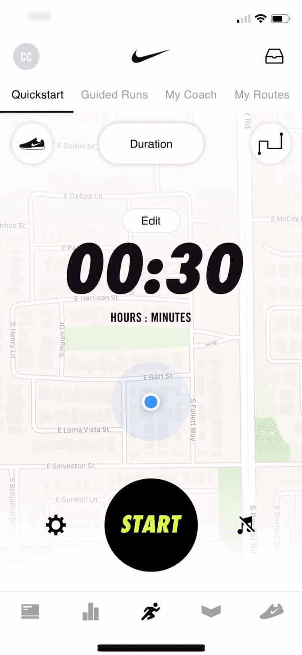
My Routes feature for Nike Run Club.
background
proposal
Conduct a competitive analysis and significant primary research through user interviews to determine opportunities to further enhance the user experience of the Nike Run Club app. This will be showcased through the addition of a new feature within the app.
As the worldwide leader in athletic apparel, Nike’s mission statement “to bring inspiration and innovation to every athlete in the world” and clarifying statement of “if you have a body, you are an athlete” has never been more clear than with the increased technology in the world. Since launching the original Nike+ app for iOS in 2010, it has grown and changed (not just names) immensely to continually try to live up to their mission statement.
The app does a beautiful job of tracking run statistics for users, providing motivation through achievements, competitions with friends, and basic coaching, and helping them to train to meet their goals. However, Nike would like to continue to push that mission forward through the development of new features within the app that better inspire and innovate for athletes worldwide.

process

research
Competitive Analysis
User Interviews
Persona

strategy
Problem Statements
Ideation
Storyboarding
User Flow

interaction design
Wireframes
Prototype
Usability Testing

user interface design
HiFi Mockups
research
The goals of the research were to determine competitors' strengths and weaknesses along with what pain points currently exist with fitness tracking apps, particularly for runners, and what the unmet needs of those tracking their fitness with apps are.
This was accomplished initially through a Competitive Analysis. That was then followed by a first round of User Interviews to get some general feedback on ways that people are using fitness apps for tracking. After some patterns started to form with general pain points, a second round of user interviews were conducted to focus more on the problems users were having. From that, a Persona was created with the goals/needs and frustrations/fears of fitness tracking.
The persona for this project was Savannah–a 33 year old Registered Nurse who loves to set and achieve fitness goals between work and caring for her children. She needs a fitness app with features that help simplify fitness planning and tracking to save her time.


Once the Persona was created, this information was used to develop an empathy map. This tool is used to help empathize with the user through thinking about:
-
what the typical day looks like for the user
-
what their hopes, dreams, or fears are
-
what is important to them
-
what their environment is like
-
what influences them
-
what obstacles stand in their way
-
what they hope to achieve
-
how they plan to measure success
By going through this exercise, we were better able to understand the users' perspectives prior to brainstorming ways to solve a problem.

strategy
With the Persona and Empathy Map in place, the next step was to form a strategy, beginning with the creation of several Problem Statements. These are a list of How Might We statements used to brainstorm the various problems uncovered during research.

From the Problem Statements, a few were chosen to focus on and were then used in an Ideation exercise. During that exercise, we set a timer for 5 minutes and sketched up to 8 different ideas for ways to solve the problem statements. Once the 5 minutes was up, we took a break, and then started again on 8 more ideas. This was repeated several times.
After going through several rounds of ideation, we moved on to creating Storyboards for our favorite ideas in a similar way. Again, we set the timer for 5 minutes and then sketched up to 8 different steps/scenes in a storyboard based on a single idea. That was then repeated for the other top ideas left before iterating on each.


Once the Storyboards were created and a top idea was chosen, they were used to create a User Flow through the new feature.
Developing a user flow helps to ensure all parts of the feature get designed by mapping out exactly what steps a user will go through. This flow is then used to inform the Wireframe designs.

interaction design
Wireframes were then created based on the User Flow, Persona information, Storyboards, Empathy Map, and User Interview data gathered during the research and strategy phases. We focused on overall usability through simple interactions that break up information into digestible pieces, simple design that has good readability, and overall layout. We also made sure to follow the design patterns already in place for the Nike Run Club app, so that the feature would feel right at home.


These Wireframes were then used to create an interactive prototype through InVision. This allowed us to see what elements worked, or didn't work, within the flow that was designed for. From there, designs were revised and updated within the prototype to get a functional baseline for the design.
This prototype was then tested with users in both 1-on-1 and group settings. This allowed us to learn a great deal about what users were expecting to encounter through a brand new feature they hadn't used before. We were also able to gather feedback about some items they expected, or hoped, to see that may have been missing or thought through differently.
During the Usability Test, we tested the flow to complete the following:
-
Create a new route starting and ending at your current location with the goal of running 4.5 miles in 47 minutes
-
Adjust the provided route
-
Save the route
-
"Run" the route
-
Share the route with friends
In the next phase, User Interface Design, the Wireframes were used to create high-fidelity user interfaces that could be tested.
user interface design
Due to the project being a feature-add to an already existing product (Nike Run Club app), there wasn't a rebrand done or new style tile created. This allowed us to move right into the User Interface Design phase based on the style of the current app.
We then used the Wireframes previously designed, along with the feedback captured through Usability Testing, to begin designing Hi-Fidelity screens of the feature.


"I always have to take the time prior to my run to map out my route in my head somewhat."
"My best workout was when I just followed exactly what the app told me to do and was able to stay off my phone and focus."
"I knew that dragging around the points on the map would let me adjust the route before even reading the instructions. That's incredibly simple."
"I would love to use a feature like this. I'd use it all the time, honestly."
reflection + next steps
Looking back at this project, it really shows just how important good user research is. As a new feature being added to and already-existing product, it's vitally important to find the right feature to solve a real problem while simultaneously fitting into the current product seamlessly. Without good research, you could end up adding a useless feature that just adds clutter to the current product rather than enhancing it.
The interaction design is very simple and intuitive. The new My Routes feature bases much of the interaction off of the design patterns already built into the Nike Run Club app. We also utilized other common design patterns found within navigation apps as well as social media apps for sharing route info.
As for next steps, the first priority would be to perform more user research to determine whether any further capabilities would be useful once they begin utilizing the feature–including the ability increase or decrease their route distance while currently on a run. Secondly, we would work to include more social features beyond just sharing routes with friends. This would entail being able to challenge friends on a shared route to compete for fastest overall time, fastest mile, etc.